Messy Files, Clear Mind
Restructuring Figma for the Flow and Remember Me teams at Checkout.com
I redesigned how two product teams organise their Figma files. In testing, errors dropped from 32% to 0% and file search time fell by 70%.
Role: Product Designer, Design Ops and UX Researcher
Company: Checkout.com
Timeline: 8 weeks
Tools: Figma, Figjam, Claude, Gemini, Flow and RM Tree Testing Tool
Overview
Checkout’s consumer teams (Flow and Remember Me) Figma workspace had become difficult to navigate: duplicate files, outdated assets, and no clear source of truth. I redesigned the filing structure and built my own tree-testing tool to test it with real users, since existing tools couldn't run the tree test I needed.
The result: search time dropped by 70%, accuracy went from 32% error rate to 100%, and 92% of users found the right file on their first click. Findability, navigation and confidence in the SSOT all improved.
Research
I ran 7 user interviews with designers, engineers and PMs to learn about the current structure and how users navigate with it in their workflow.
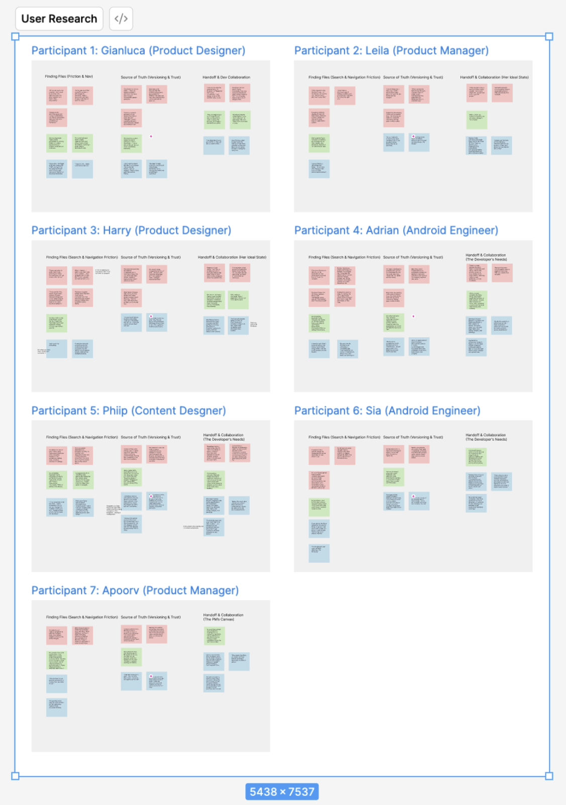
Here’s what some of the research revealed:
Engineers, PMs and Designers were scared of working on the wrong files by mistake.
As a result, users developed a dependency on
One theme came up again and again: users relied on Slack to find their files. Instead of navigating the workspace, they'd dig up an old link from a past chat or ping someone directly for it. Slack links weren't the problem, sharing a link is normal, but over-reliance on them was: it masked the real issue instead of solving it. Users need to be able to navigate the workspace independently, not depend on someone else to hand them the right file.
I also audited every file across the workspace:
6 folders
2 untitled files
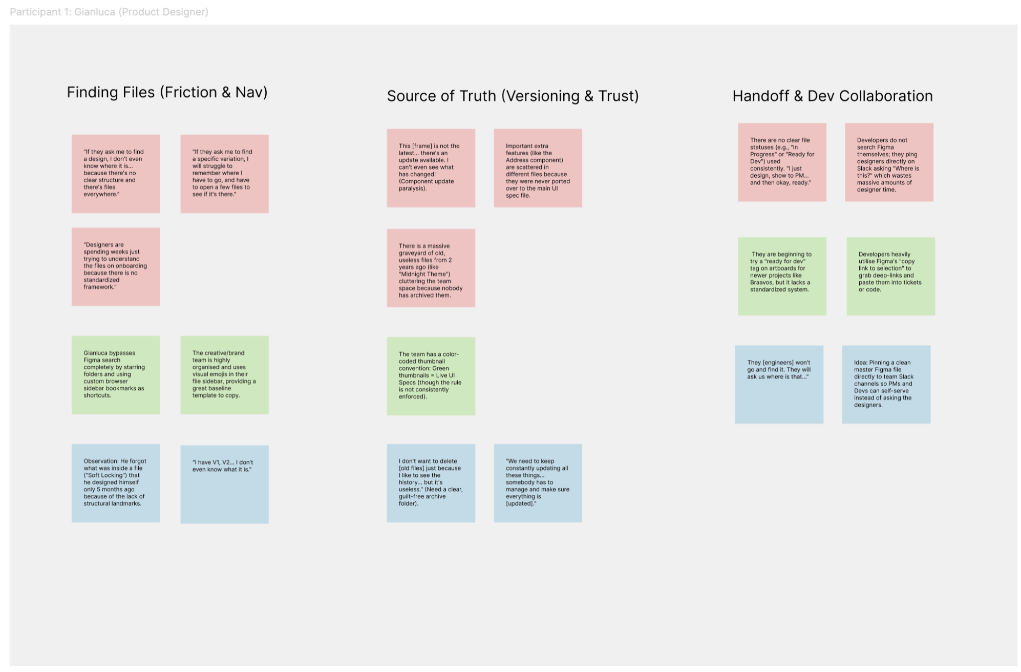
If asked to find a specific design file independently, he has absolutely no idea where to go.
73 files
“I spent 2 days working off the wrong file.”

3 duplicate names
“The folders are deeply confusing and bloated. It’s full of random files.”
5 outdated files
2 playground files in production spaces
Together, the interviews and audit clarity was the missing piece, and it needed to be fast, so I framed the challenge like this:
How might we create a clear filing structure so any team member can find the right file in under 30 seconds?

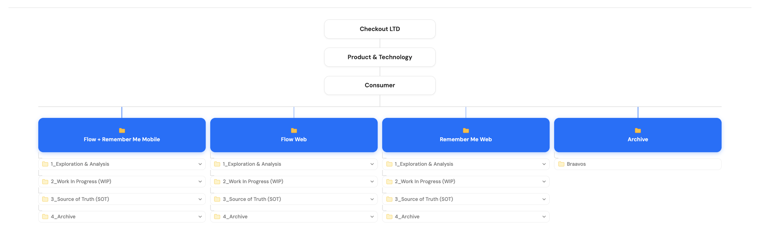
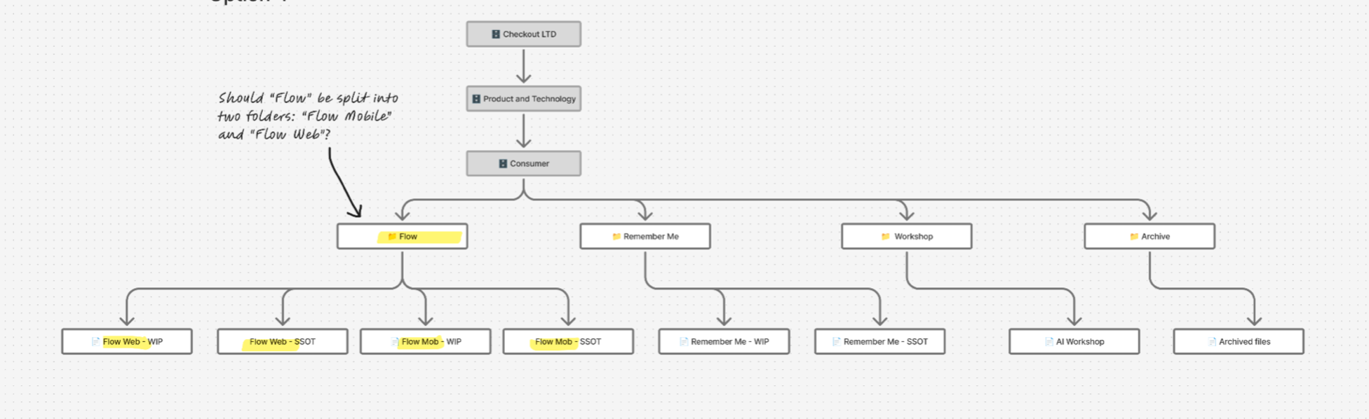
Structure by team, not by product
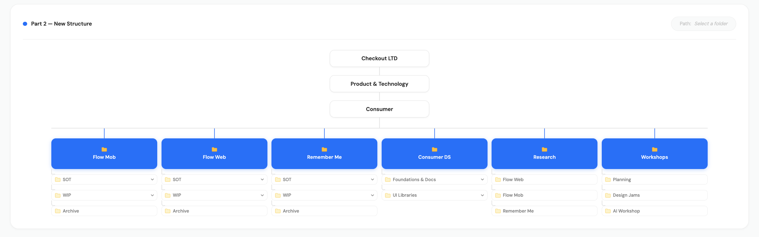
My early iterations followed product lines. Once I understood how the teams actually worked, I saw that Flow Mobile and Flow Web needed separate homes. Everything was reorganised around teams, which is how people actually look for things.
WIP, SOT and Archive Folders
The new structure introduced nested folders. Each team folder contained three main subfolders: SOT (Source of Truth), WIP (Work in Progress), and Archive, each holding files that matched its name, so users always knew where to look.
The Archive folder solved a specific problem: not every old file needed deleting, but it didn't belong in an active space either. Older design versions, for example, could live there without cluttering day-to-day work.
Based on the original audit, I also added a Consumer Design System folder, a Research folder, and a Workshop folder, to give a home to content from the original structure that didn't fit neatly into SOT, WIP, or Archive.
Built my own testing tool
Maze couldn't run the tree test I needed, and I didn't want a weaker substitute. I wanted real behaviour from real people, so I built my own tree-testing tool and ran user tests comparing the old and new structures, measuring accuracy, time to complete, and direct and indirect paths.
Below is a snippet from a real session with Checkout's Director of Product Design. The tool recreated the actual files and folders as they existed, so users navigated the real mess rather than a simplified version, which emphasised the friction people actually felt.
Results
100% Accuracy
The old structure caused a 32% error rate, whilst the new structure achieved 100%
70%
Faster
Average lookup time dropped from 30 seconds down to 9 seconds, a 70% speed increase.
92%
Direct path
Over 92% of users went to the correct file on their first click, compared to 47% in the old structure.
When tested with the new structure, users consistently said navigation felt much easier.
“I feel more confident”
“This is so much faster”
“A lot easier now.”
Evolving strcuture
The early version worked, but testing surfaced one more opportunity: the Consumer Design System, Research, and Workshop folders weren't pulling their weight. They had been my assumption from the audit, not something users actually needed, and they had added a layer of complexity nobody used
So I refined the structure, folding those three folders into a simpler system built around a clear numbering convention: