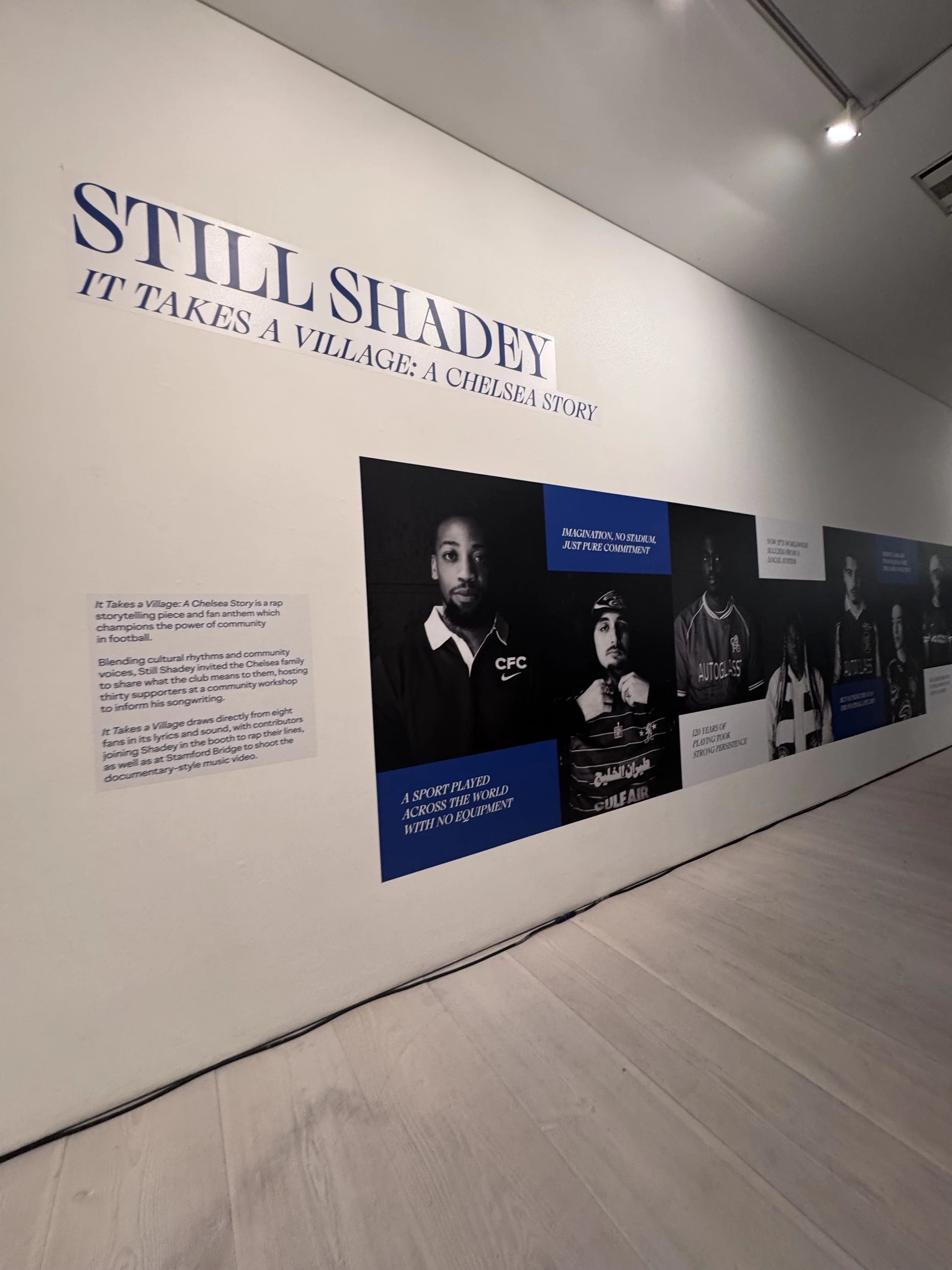
It Takes A Village: A Chelsea Story
Community-Centred Storytelling Through UX Thinking & Visual Design
Role: UX/UI/Visual Designer, Researcher, Creative Director & Photographer
Client / Partners: Still Shadey · Chelsea FC · Chelsea Foundation · VERSUS
Exhibited at: Saatchi Gallery
Project Type: Community storytelling · Research-led visual design
Timeline: November 2024 - January 2025

A Chelsea Challenge.
How might we visually represent Chelsea FC community voices in a way that feels authentic, human, and emotionally resonant, while staying true to the people behind the stories?
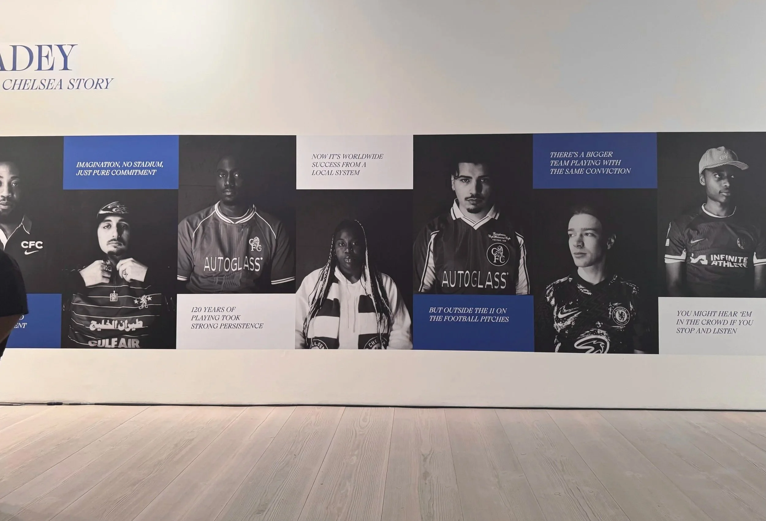
This project formed part of It Takes a Village: A Chelsea Story, a rap storytelling piece celebrating Chelsea FC and its community, created by Still Shadey as part of the Blue Creator Fund.
The project centred on real people, real thoughts and real stories
Stories were emotionally personal and needed respectful representation
So the visuals had to:
Honour individual identity
Support the narrative of the music and film
Translate lived experiences into a gallery-ready format
Research & Discovery
I facilitated a research workshop with Still Shadey at Stamford Bridge with 30+ Chelsea fans, capturing:
Personal experiences with Chelsea FC
Emotional connections to the club
Community, belonging, identity, and resilience
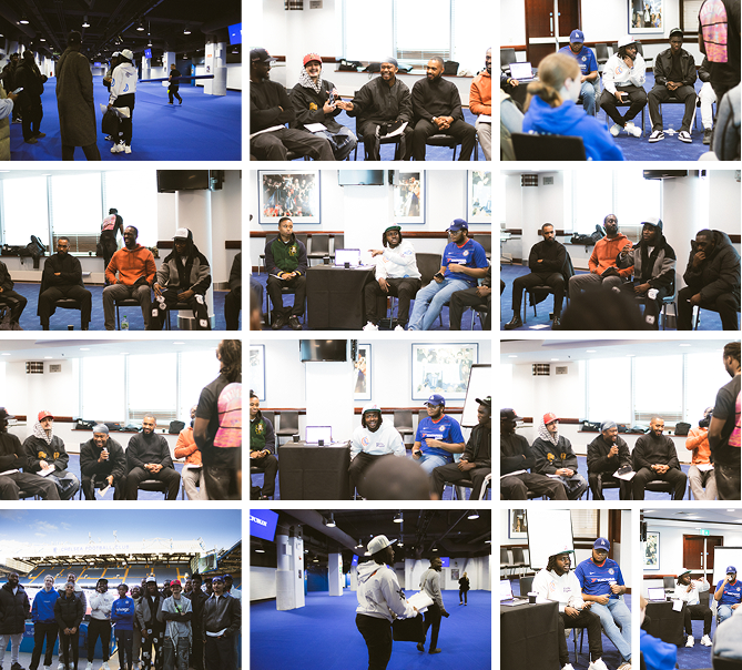
From this research 8 fan stories were selected as core narrative voices for the project.

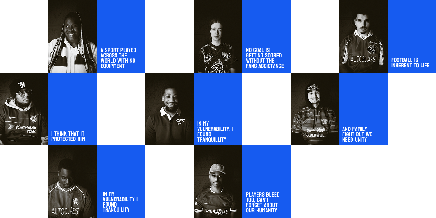
Theme 1: Football as
Identity & Life
“Football is inherent to life”
“The game is a big deal for many”
“We give the players the support. We are being a part of the whole game”
Research synthesis and affinity mapping fan voices
“Football became my everything. I found peace when I played”
“The game is a big deal for many”
Theme 2: Fans as Active Participant
“The energy from the fans is what pushes players forward.”
“No goals are getting scored without the fans assistance”
Theme 4: Football as Peace, Healing & Emotional Release
“Football helped me find peace during difficult times.”
“Football to me is about healing and getting over silly disputes…”
“I escape when playing and watching”
Theme 3: Unity & Family
“Even when we don’t agree on much, football is what connects our family.”
“…when the game is on, just shutup and watch it.”
By clustering fan quotes into themes, I identified emotional drivers around identity, healing, shared humanity, and participation. These insights informed how each fan was visually represented, ensuring portraits centred not just faces, but lived experience.
Theme 5: Shared Humanity Between Fans & Players
“People forget that the players go through the same things we do”
“Players bleed too, we can’t forget their humanity”
Reimagining user personas through photography
With the key themes identified through affinity mapping, I moved into the design phase by translating these insights into human-centred visual representation.
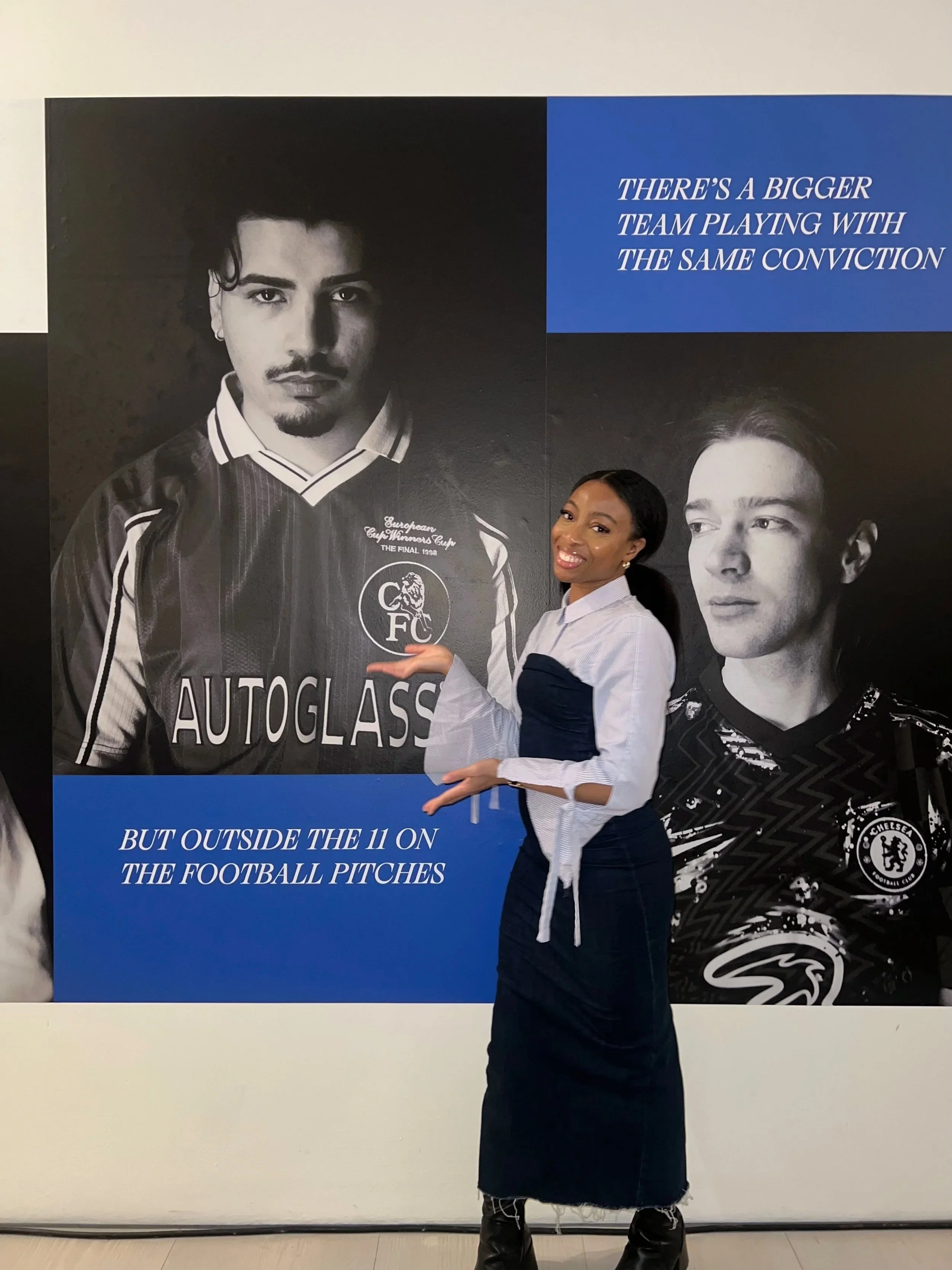
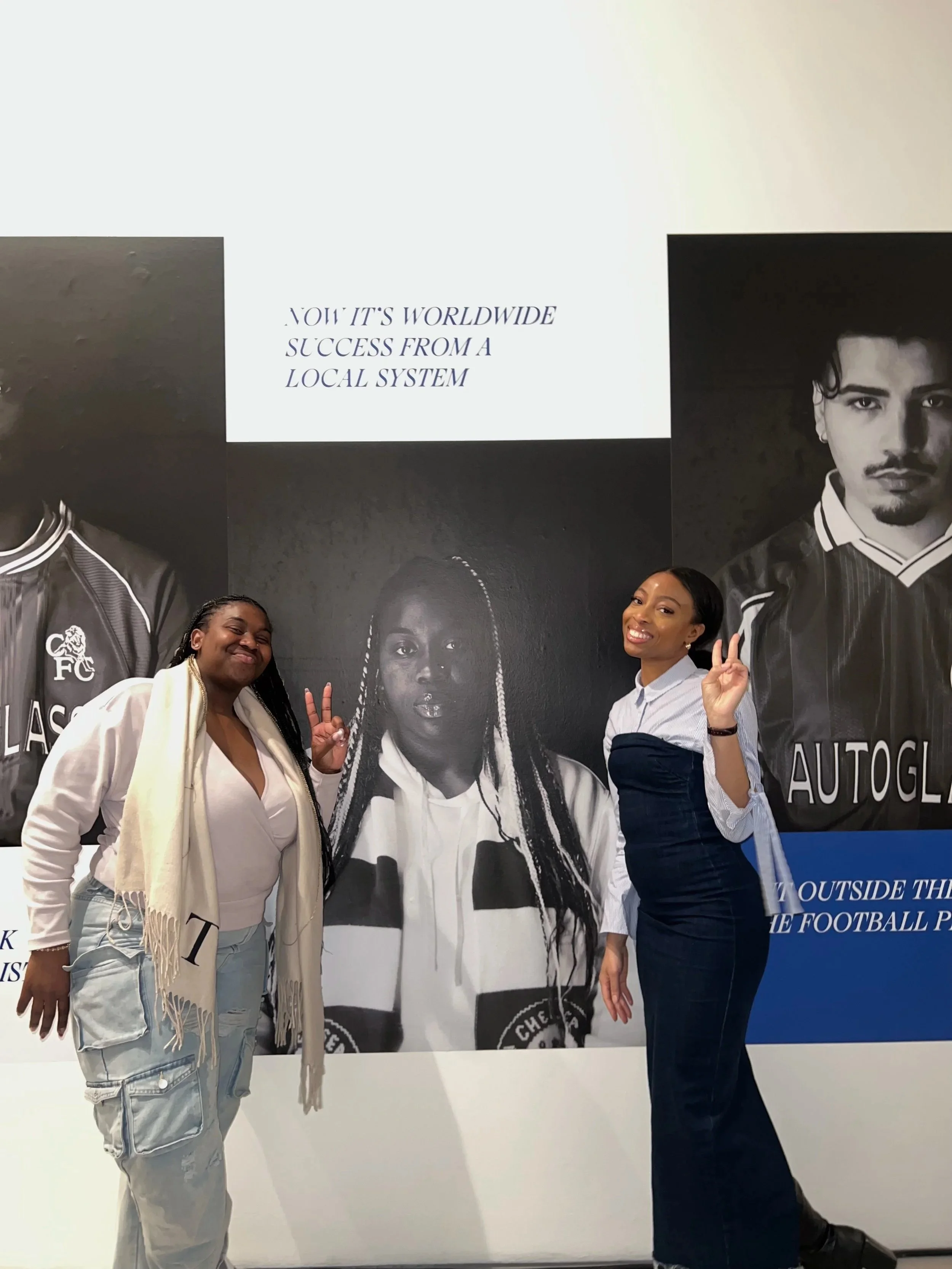
Rather than creating traditional UX personas, each fan became a living user persona. Their portrait, paired with lyrics and quotes drawn directly from their own words, formed a physical narrative experience within the exhibition. These elements acted as experiential touch points, shaping how audiences moved through the space, paused, reflected, and emotionally engaged with real voices, identities, and shared humanity rather than abstract profiles.
In this context, the exhibition space became the interface, and audience movement and attention became the interaction.
So why these design choices?
Each visual decision was directly informed by the themes that came up in research, ensuring the final work remained authentic to fan voices and emotionally grounded in lived experience.
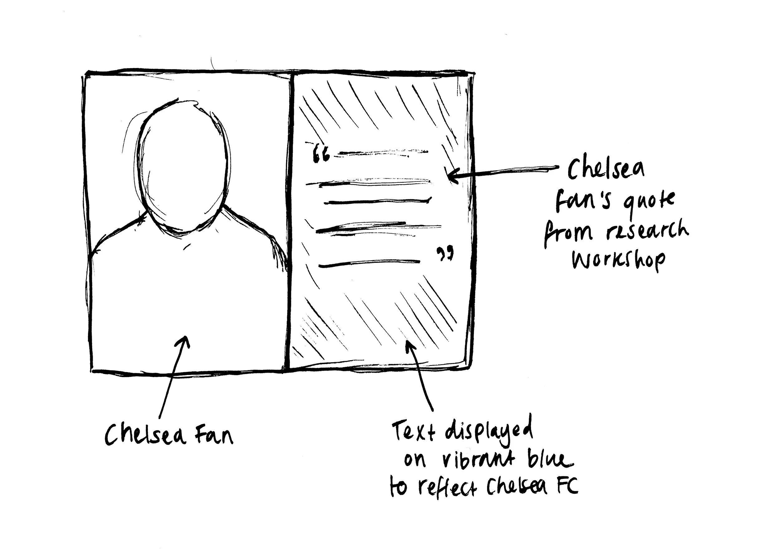
Design Decision 1: Treating fans as personas, not subjects
Insight from Research:
Fans expressed football as deeply tied to identity, humanity, and lived experience.
Insight from Research:
Fans expressed football as deeply tied to identity, humanity, and lived experience.
Insight from Research:
Football was described as both emotionally intense and grounding.
Design Decision
Each fan was represented as a living user persona through portrait photography rather than anonymised profiles or fictional summaries.
Design Decision
Portraits edited in black and white to centre humanity. Quotes were presented in a vibrant Chelsea blue, referencing the club’s identity while creating contrast.
Why This Matters
This ensured representation felt human, allowing audiences to connect with real people rather than abstract concepts.
Design Decision 2: Pairing portraits with lyrics & quotes
Design Decision
Lyrics and quotes were pulled directly from fan narratives and paired with each portrait as graphic elements within the exhibition.
Why This Matters
This preserved authenticity and ensured the visuals amplified lived experience rather than speaking on behalf of the fans.
Design Decision 3: Colour, contrast & visual hierarchy
Insight from Research:
Fan stories carried strong emotional weight and needed clarity without overpowering the individuals behind them.
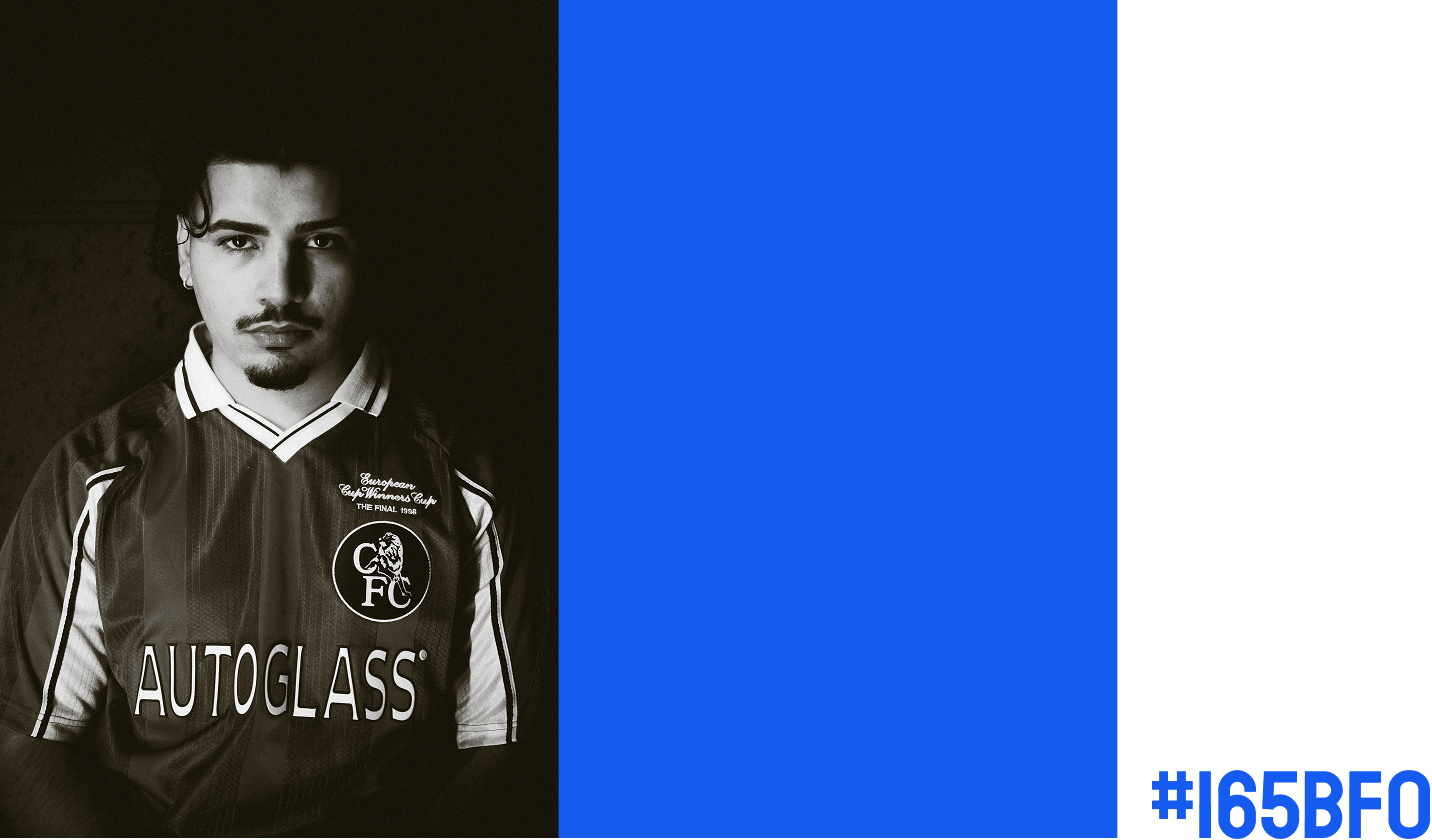
Design Decision 4: Minimalist composition to prioritise voice
Design Decision
Portraits were composed with minimal visual distractions and restrained framing to keep focus on expression, posture, and narrative.
Why This Matters
Contrast helped fan voices stand out, while the b&w portraits retained their visual strength. This balance ensured text and image coexisted without one overpowering the other.
Why This Matters
This supported emotional clarity and reflection, allowing viewers to engage deeply without visual noise.
Final Outcome:
The Exhibition Experience
The outcome of this process was a portrait-led narrative exhibition that brought fan voices into a shared physical space.