Arctic Travels
Arctic Travels – A lighter, clearer way to book ski holidays.
Grounded in research from leading travel platforms, this project restructured a traditionally dense booking flow into a clean, guided experience with scalable logic and a calm visual system.
Scope
Competitive Analysis
User Research
Visual Design
Design System
Prototyping
User Testing
Challenge: Reducing cognitive load and decision fatigue
Ski holidays come with many decisions: equipment, terrain, accommodation, safety, dates, and transport. Most booking platforms present all of this at once, which quickly overwhelms users. People become unsure of what to choose, what matters most, or what to do next, leading to hesitation, confusion, and drop-offs.
The challenge was to create a booking experience that felt much lighter and easier to move through, without removing the important details users need. This meant breaking information into smaller steps, creating a clear order for decisions, and designing a layout that reduces mental strain.
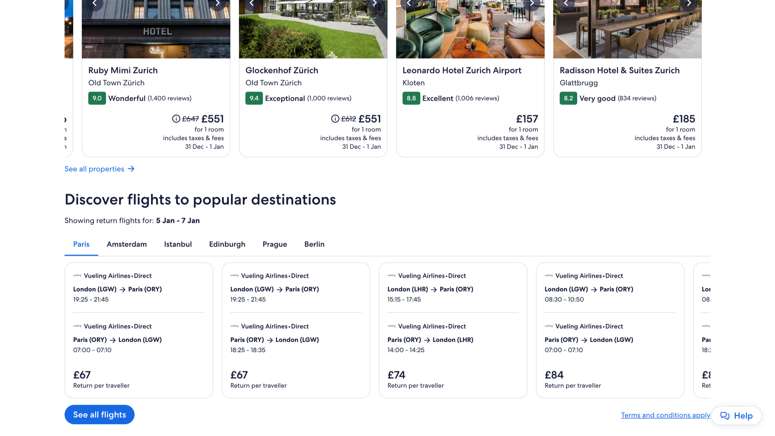
Competitive Analysis
I analysed Booking.com, SkiWeekend, and Expedia to understand the patterns behind user overwhelm.
The same issues appeared across them:
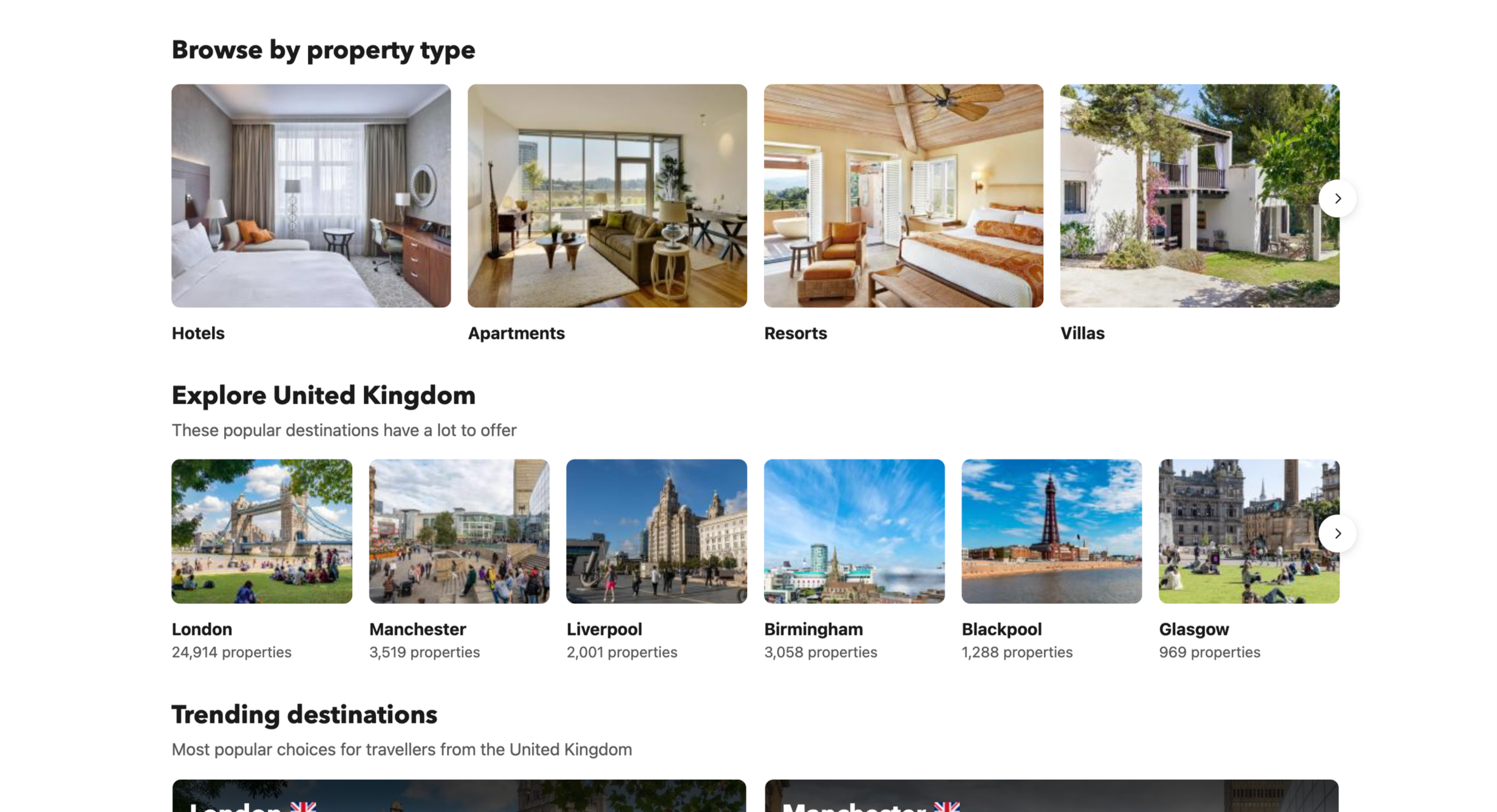
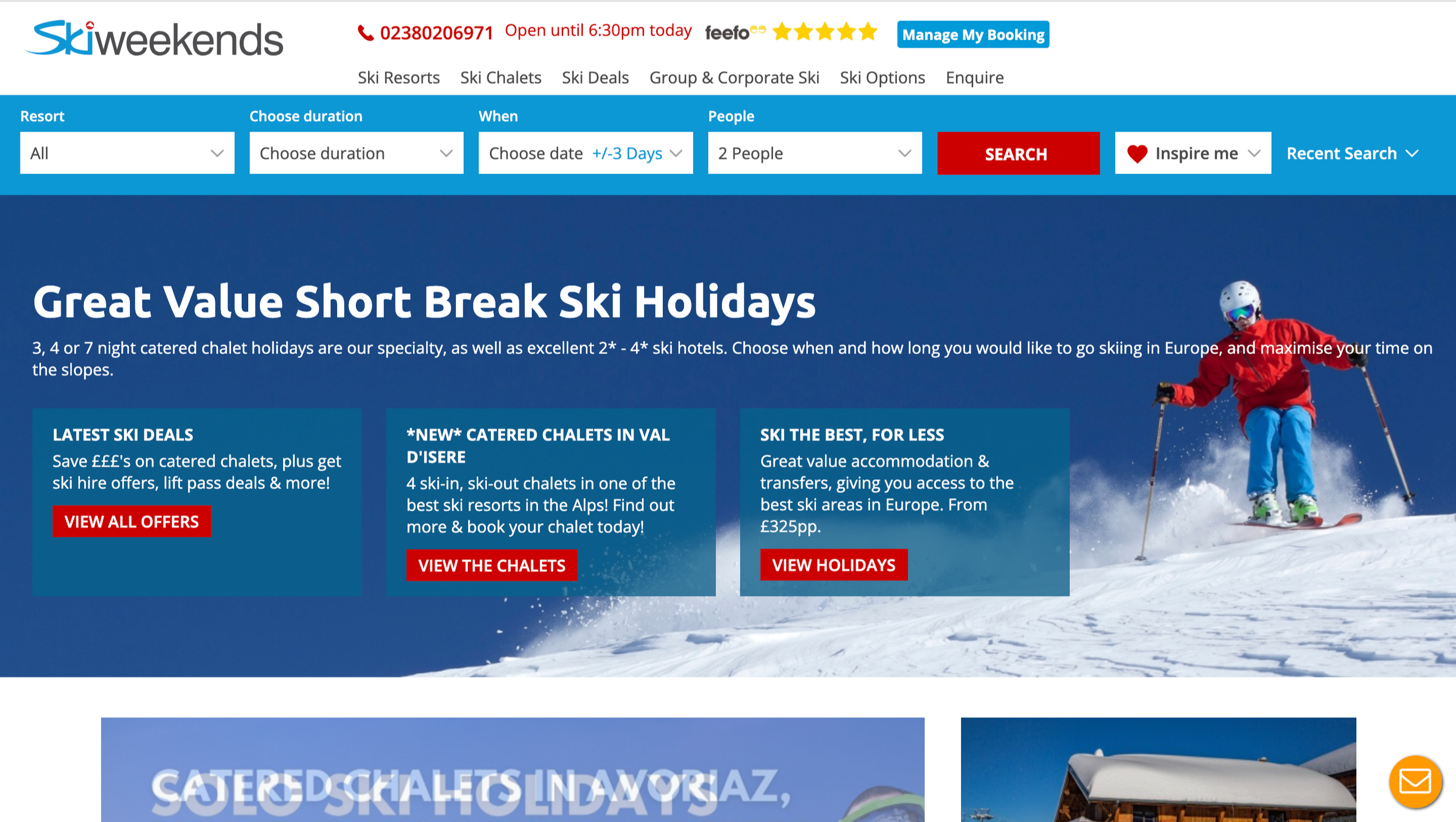
• Dense, text heavy screens
• Unfamiliar ski terminology
• Non-linear navigation
• Too many options
• All information shown upfront
| Platform | Strengths | Weaknesses | UX Opportunity |
|---|---|---|---|
| Booking.com |
|
|
|
| SkiWeekend |
|
|
|
| Expedia |
|
|
|
Conversations with real ski travellers reinforced this. Regardless of their experience level, users described the booking process as confusing and mentally draining.
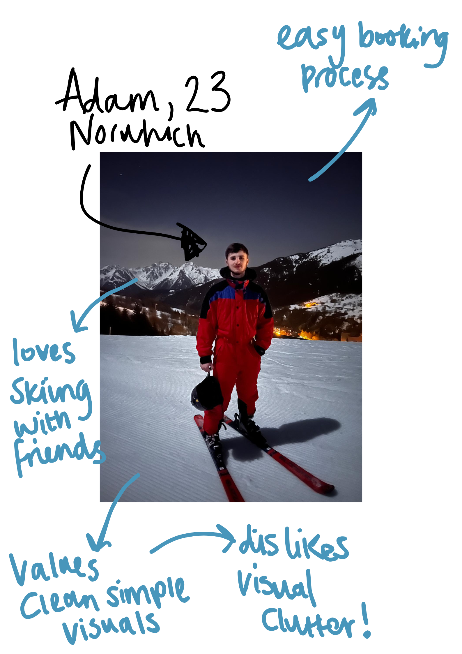
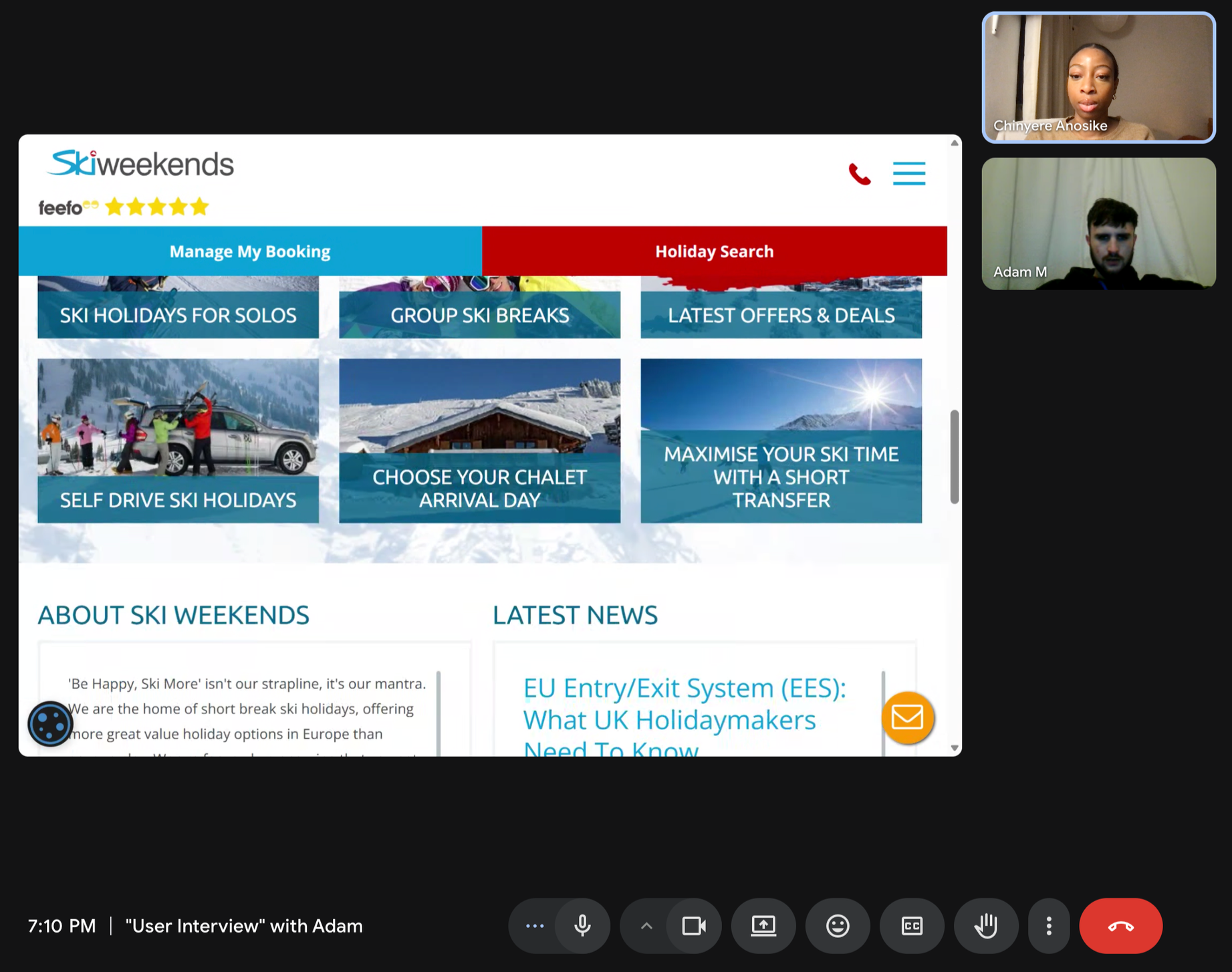
“It just feels too much and very cluttered. There’s so much going on that I don’t know where to look first. ”
So what?
When presented with too much information at once, Adam’s cognitive load increases, slowing his decision-making and reducing confidence in completing a booking. To support faster, more confident choices, the experience must prioritise clarity, limit visible options, and guide attention through clear visual hierarchy.
How might we create a booking experience that reduces cognitive load and drop offs?
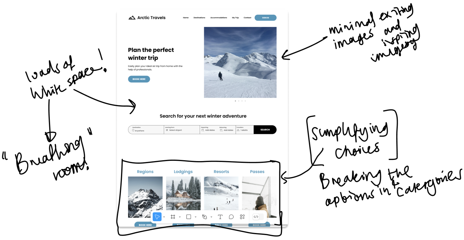
More white space for breathing room
Existing platforms compressed too many actions and filters into tight layouts, creating immediate visual overload. Increasing white space allowed key decisions to stand out, reduced scanning effort, and made the interface feel calmer and easier to process.
Applying Hick’s Law to reduce decision fatigue
Users struggled most when presented with large sets of choices simultaneously. By breaking decisions into smaller, more manageable steps and reducing the number of visible actions at any one time, I aligned the booking flow with Hick’s Law, helping users make choices faster, with greater confidence.
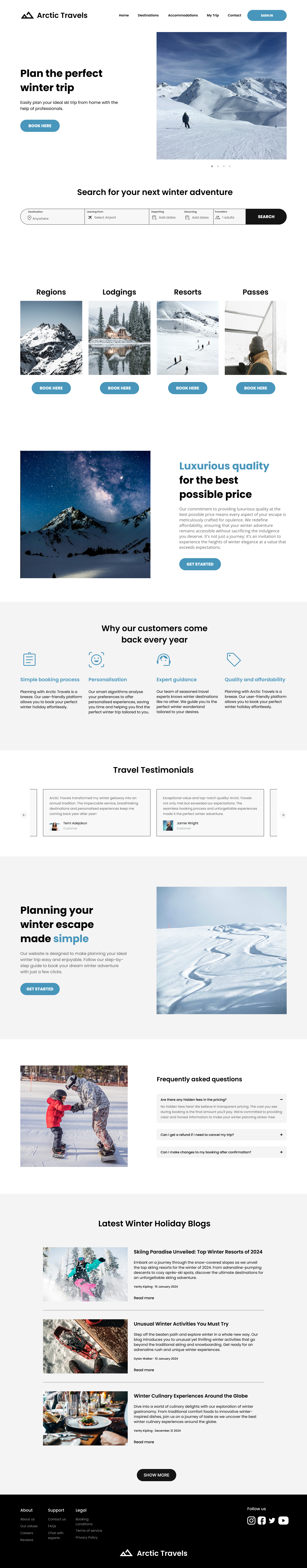
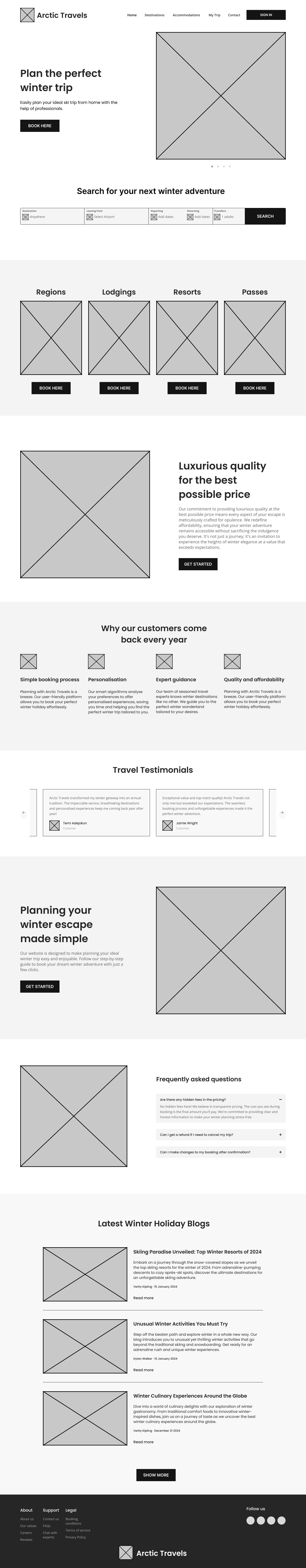
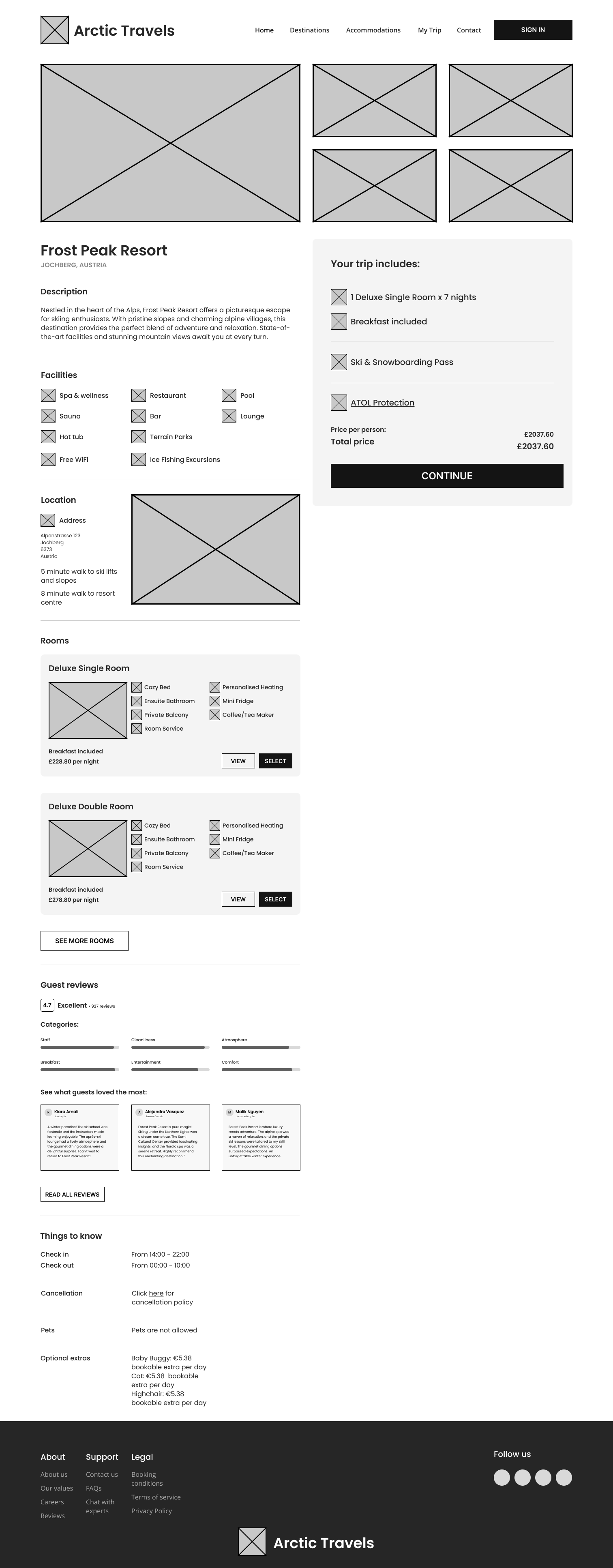
A seamless, cohesive design system
I developed a consistent visual language built around clarity and calm. Typography, spacing, colour, and component patterns were standardised to minimise distractions and help users recognise familiar UI behaviours across the journey. This system ensured each screen felt predictable, structured, and easy to navigate.
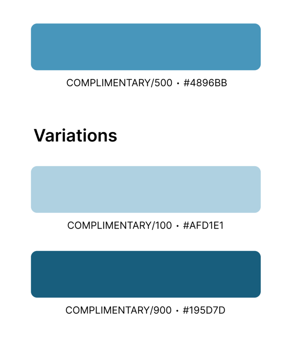
The blue colour palette was intentionally chosen to promote calmness and reduce cognitive load, drawing on colour psychology research (Elliot & Maier, 2014) that links blue to emotional stability and trust. Cool tones improve processing fluency, making information easier to absorb, while also reflecting Arctic elements such as ice and snow. Nielsen Norman Group research further supports blue’s effectiveness in creating calm, trustworthy interfaces for complex decision-making environments.
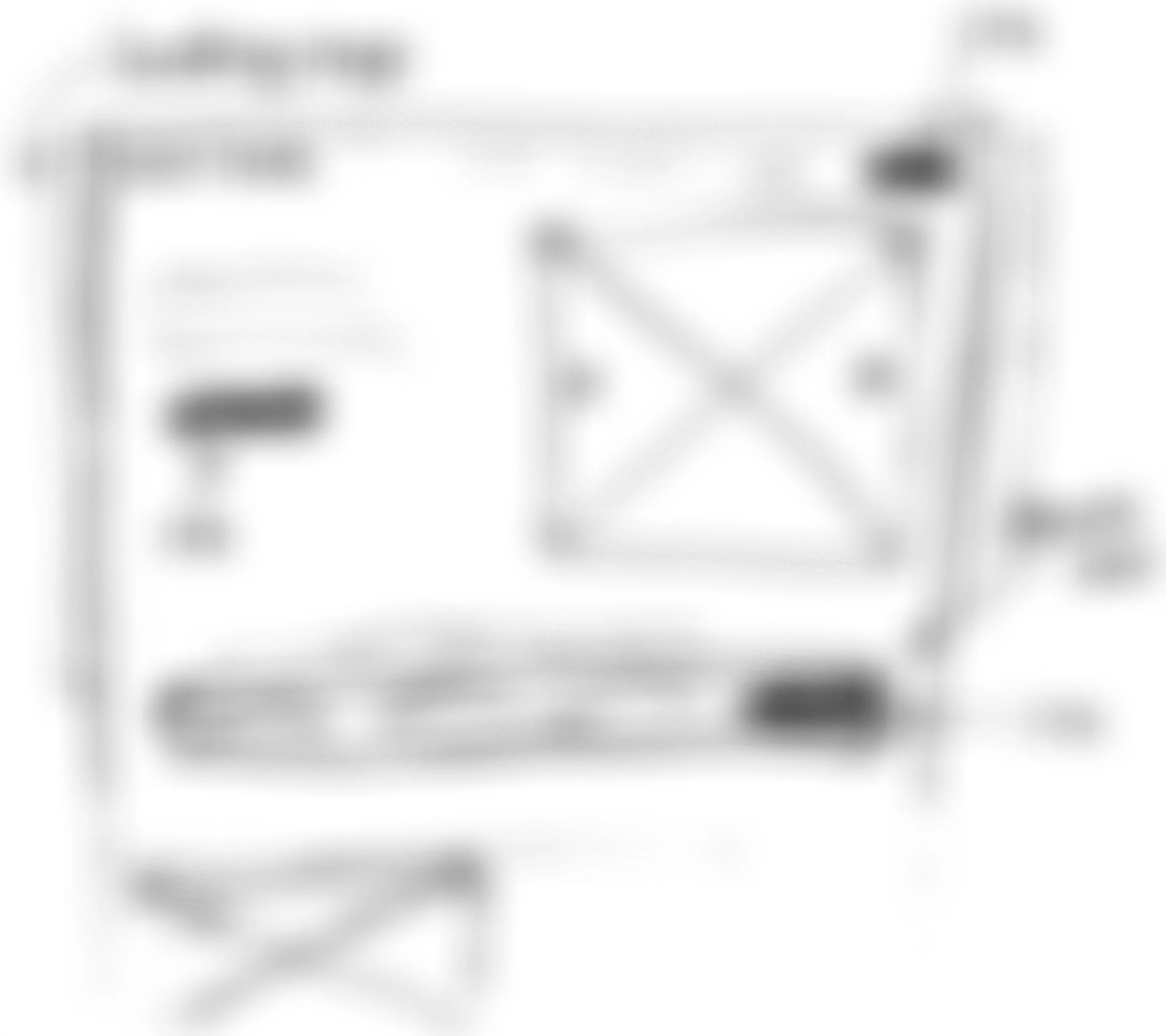
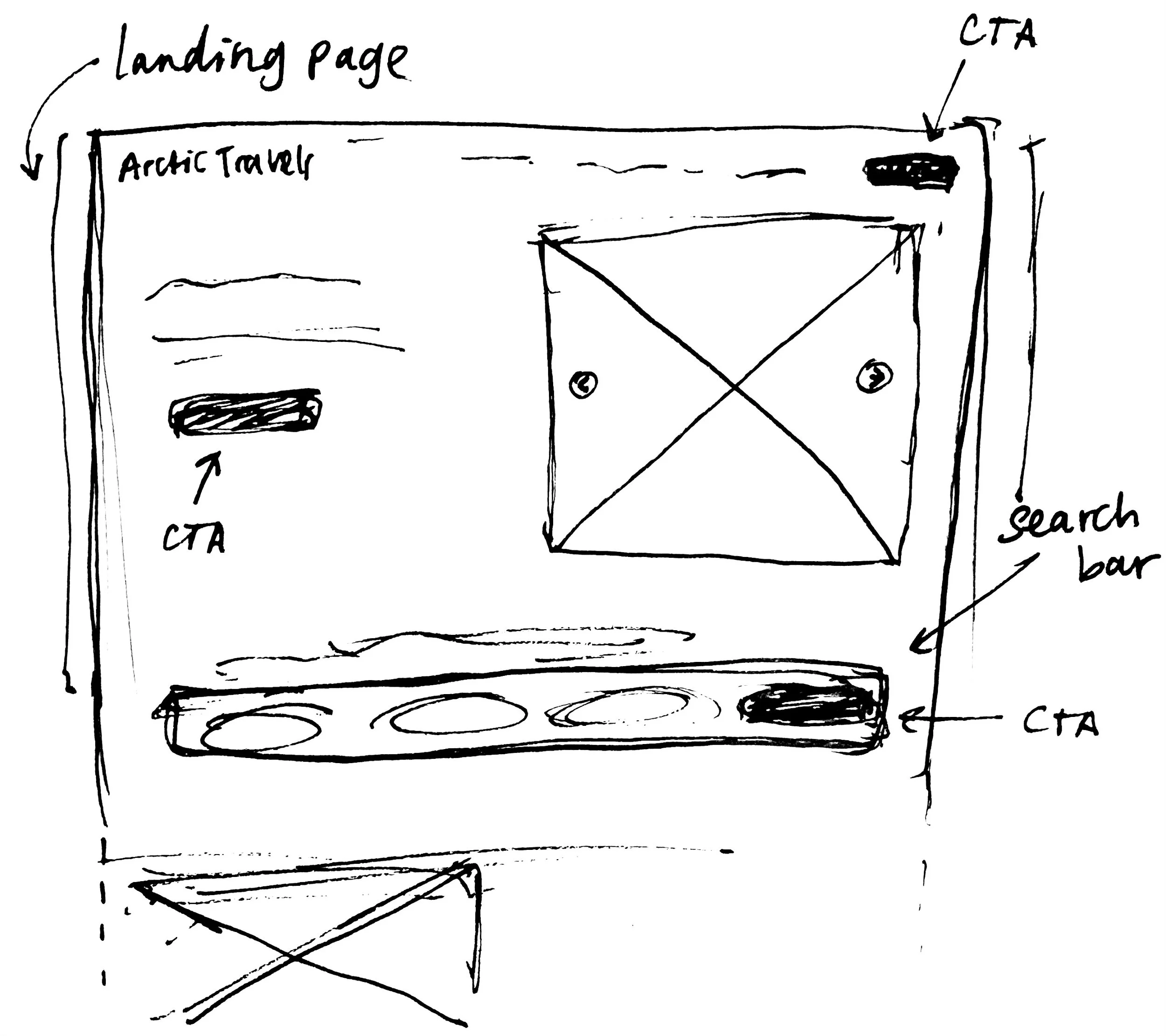
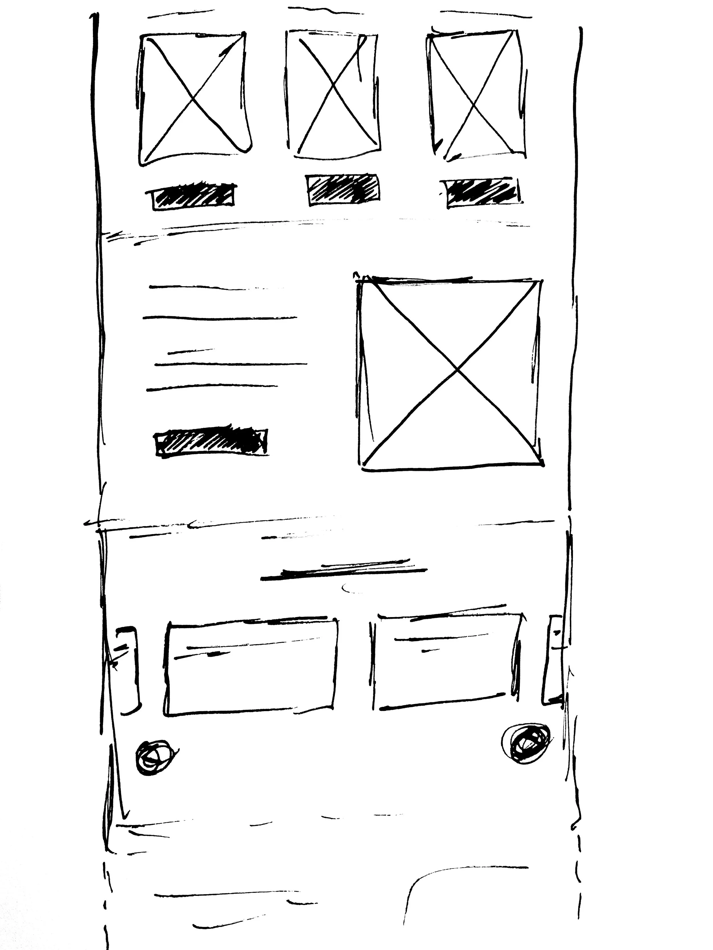
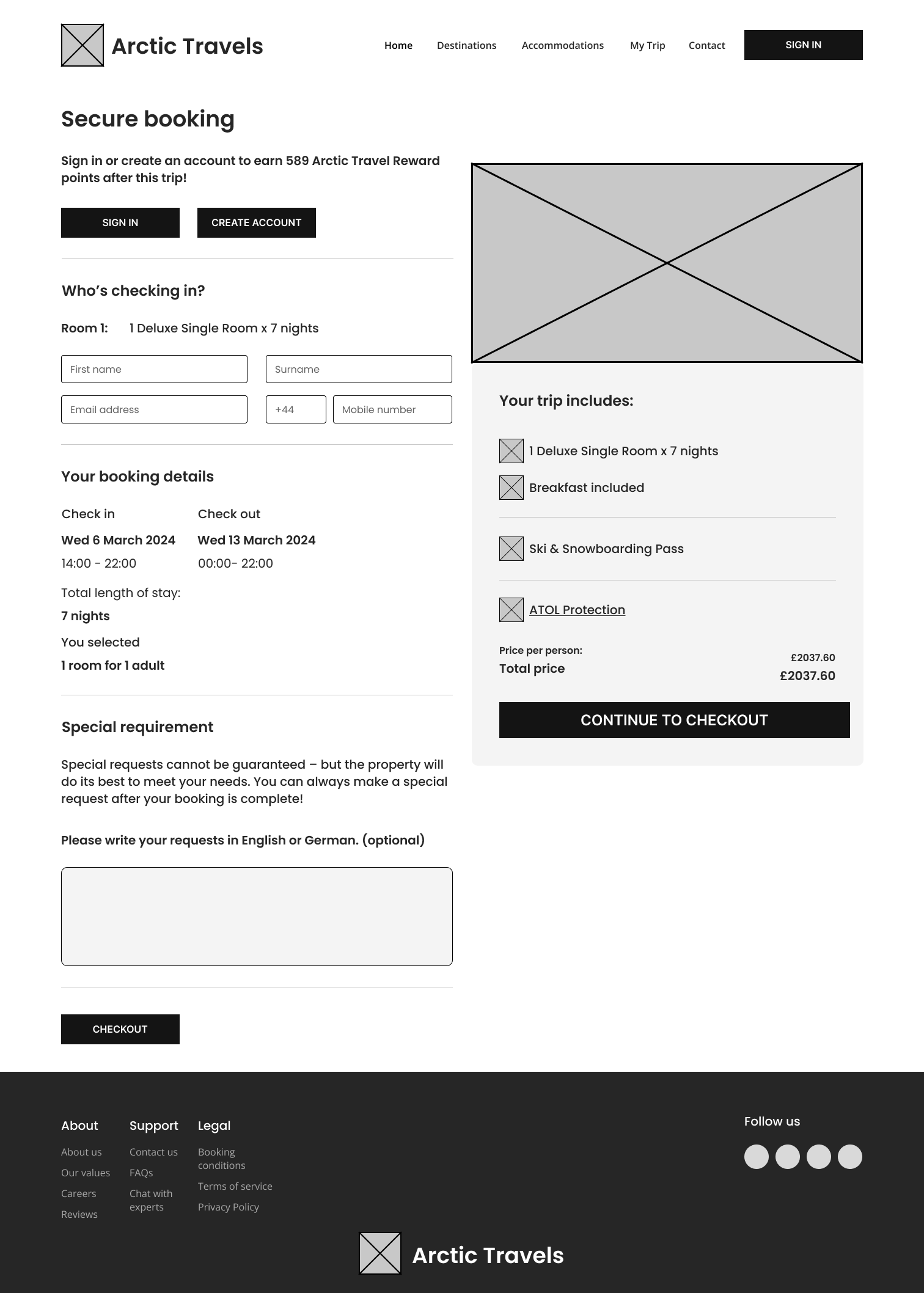
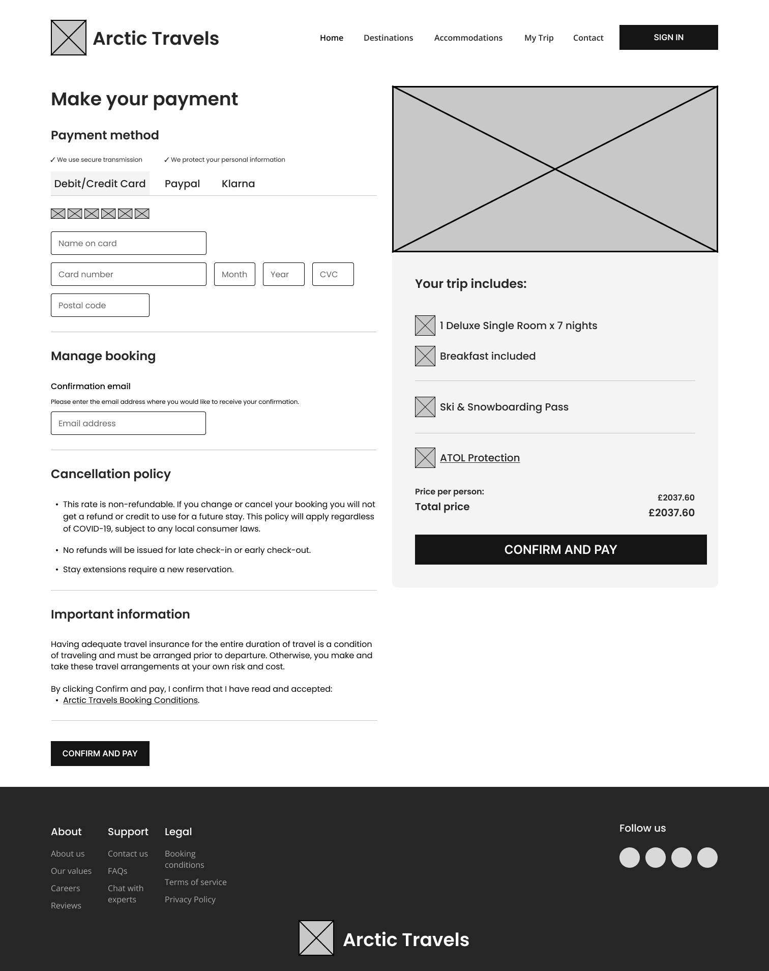
Wireframes and hi-fis prototypes
These low-fidelity wireframes were created to explore layout, content hierarchy, and user flow without visual distraction. At this stage, the focus was on defining key entry points, reducing cognitive load, and ensuring a clear path from discovery to booking.
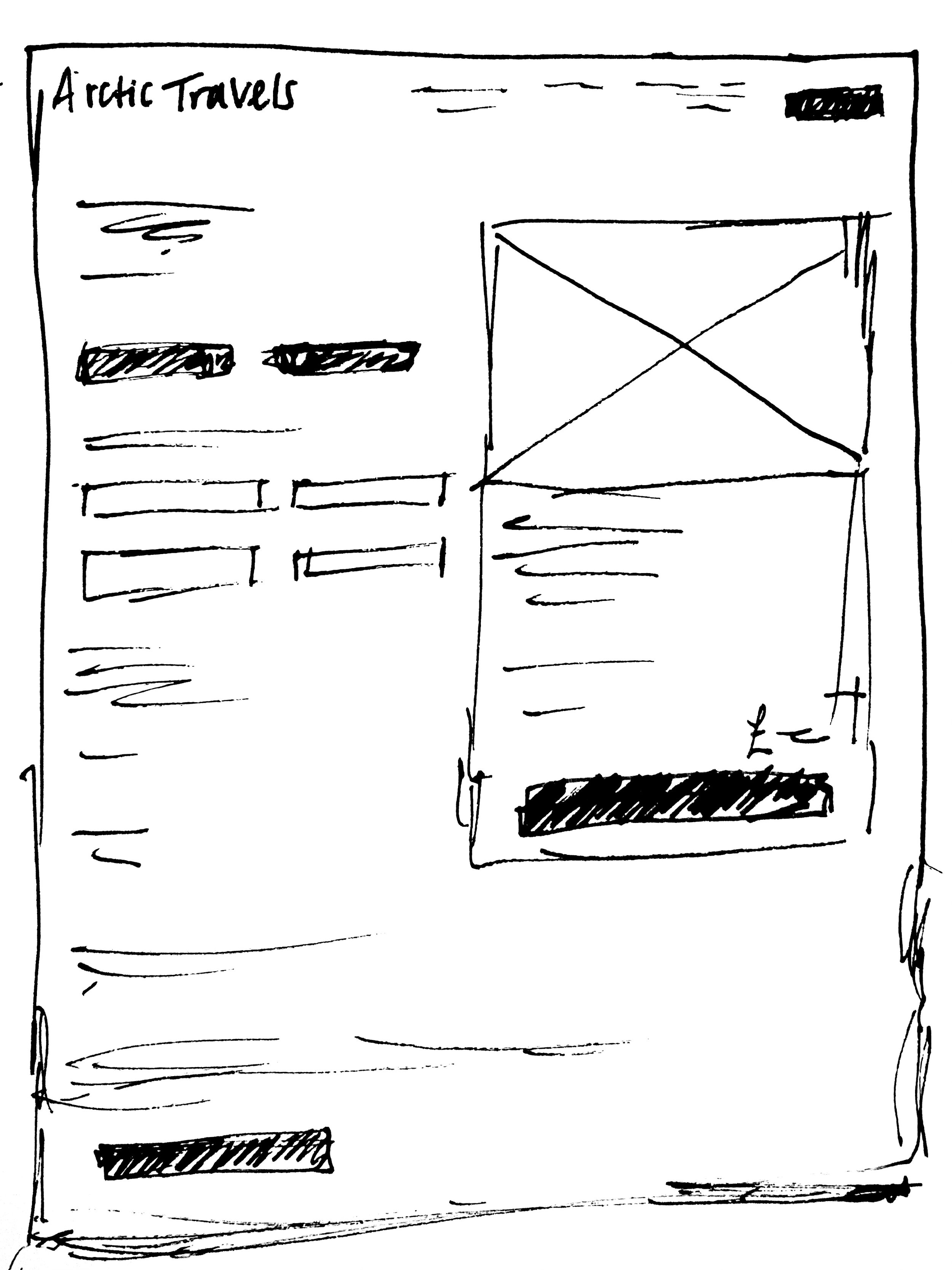
These rough sketches were developed into high-fidelity wireframes to establish tone, visual consistency, and usability.
These rough sketches were developed into high-fidelity wireframes to establish tone, visual consistency, and usability.
Then these wireframes came to life…
Click here to view the high fidelities on Figma
User Testing & Validation
I revisited Adam with the new designs to test whether simplifying the interface improved decision-making. The reduced visual noise and clearer hierarchy helped him navigate without distraction or hesitation.
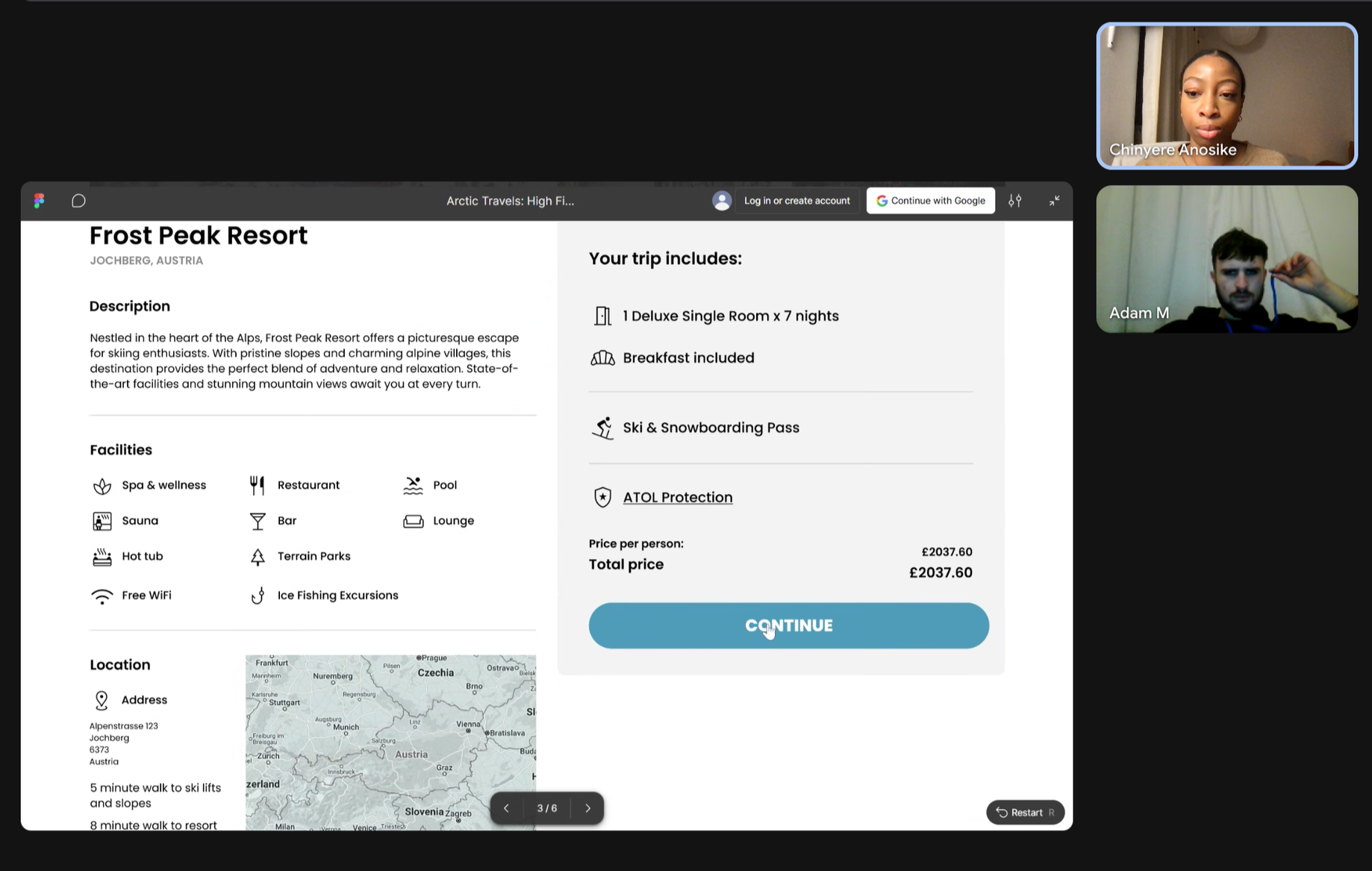
“It’s much simpler and cleaner. I know where everything is.”